I like my InDesign files tidy, and while we are on the subject, there’s nothing like a lovely, precise template. (Have I mentioned that I love creating templates?) That said, I am not neat on the front end. My initial design files are messy. Like most designers, as I move elements around and around and around, inevitably, the swatch palette grows with colors of unknown origin, layers become a jumble, and disregarded type litters the pasteboard. However, as I move towards wrapping up a project, everything goes in its place.
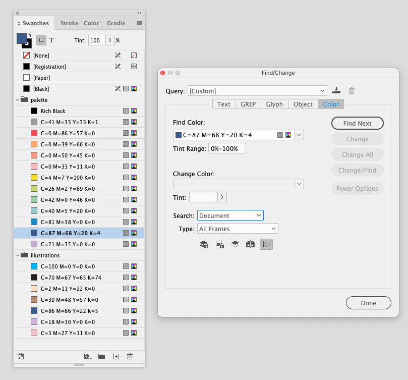
I start by deleting anything still lingering around on the pasteboard. At this point, that should be everything except maybe a few notes to myself. Then I get to work on the color swatches. I delete unused and duplicate swatches, make tints correctly, consistently name colors, and resolve any other problematic swatches. I love the relatively new Find this Color feature. It makes this process infinitely more straightforward. It’s a rare day when I group colors, but I’ve taken a shine to it lately where it makes sense. 
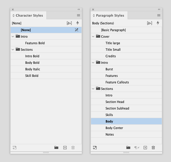
Moving onto the paragraph, character, and object style panels, I repeat the process by removing used styles, creating new ones if necessary, checking naming conventions, and creating groups if appropriate. 
Bleeds are pulled and snapped neatly, boxes abutted nicely, and every detail finds its proper layer. Finally, I package up the project noting and fixing any image, color, or font issues before I post my work, sit back, and relax.
Aahhh. File tranquility.
